Babble On by Andrew Brobyn is a memoir about someone who is deeply conflicted and mired at the intersection of drug dependence, the criminal underworld, and mental health issues. Our Art Director Laura Boyle walks us through her cover design process for this book, and also shows us some earlier design concepts as well!
Did you read the book to get a sense of what it was about before you started designing?
I read large sections of every book I design. I usually ask the editor for suggested excerpts, but I often get pulled in and end up reading more. I also gather a lot of intel before I begin designing. I’ll often have chats with the editor, and solicit input from Sales and Marketing, and of course consult the author’s own cover vision brief, which they submit early in the process. I draw a lot of inspiration from the briefs, since no one knows the book as intimately as the author does. But I also try to look for different interpretations of the subject matter, since I have the advantage of objectivity.
What was your approach in designing a book cover for a memoir?
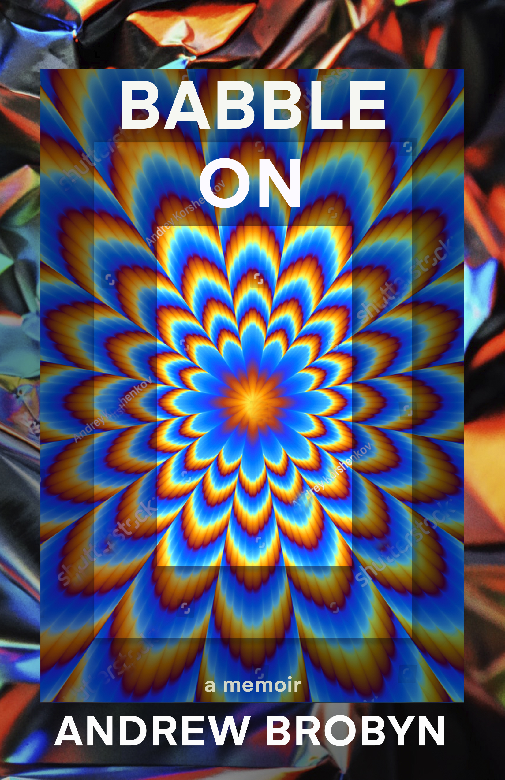
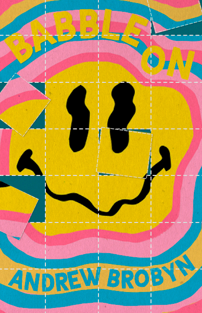
It’s different for every memoir because of course, like fiction, the tone and subject can vary widely. I usually get a sense from a few key indicators what, broadly, the tone of the cover should be. Like you know, if it’s a memoir about a young woman’s dating life, or a mother’s experience of loss, or a man overcoming an eating disorder, these will have certain stylistic implications. In the case of Babble On, it was key term “acid trip” that steered me. Challenge accepted! Did I do research? Indeed. I didn’t go ‘Method’ though if that’s what you were wondering. It was fun coming up with various covers that looked like acid trips. I think I’ve never had such a wide range of directions on one cover. One of them came out looking like a different kind of trip, ecstasy maybe or one of the bad ones in a scary underground nightclub. Then I got really into the idea of a warped, melting smiley face. The one thing all these ideas had in common was extremely saturated eye-bending palettes and imagery.
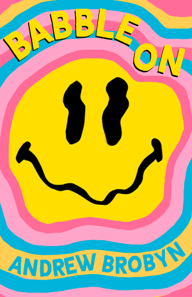
The team that discusses covers got quite involved as well. Everyone has an idea of what a drug memoir ought to look like. Acquiring editor Julie Mannell and I both were firmly behind the melting smiley face and others on the team weren’t convinced, and thought it at least needed to more strongly signal ‘acid’, so I put it on a blotter, and this is the version we sent to the author. It turned out though that it didn’t resonate with Brobyn, and he didn’t find the image really suited him. Which is fair enough; I’d been designing an object, but in the end a memoir should reflect its subject. I set about trying to find the solution. The team discussed the other 5-10 strong concepts I’d created. One of them could perhaps have worked, but I scrapped them and went back to the drawing board completely, and it’s good that I did because I ended up finding the image that fit perfectly. When the author saw the new version, to my relief he responded enthusiastically, and I knew all the effort had been worthwhile!
How much does font matter in a cover with a busy background?
It matters a great deal. You certainly couldn’t use a thin or overly expressive typeface. And Marketing especially is always looking for the title to read well at thumbnail size, for ads and online visibility.
Do you think of these things when designing? Like do you ever see an image that would make a great book cover then think “uh oh, how can I make a font work with this?”
I think about these things for sure, but where there’s a will there’s often a way. Either it’s the font you choose, a specific crop, or subtly darkening or lightening parts of the image. When I’m working with an illustrator, I remind them to leave white space for the type and usually create a typeset mockup so they know what areas they have to work with and around. So, you know, yes, it’s an important consideration, but not usually an impasse. The image on Babble On is busy but I moved things around strategically, added or removed elements to work around the title and author name.
Can we see another version (or two) of the cover, and what you thought of them?
I mentioned the melting smiley face. I don’t even know why I love it so much, but I think it’s just very nice to look at and pleases my eye and makes me feel the right feelings (especially the cleaner version). I have several variations on this concept and here are a couple:
I mentioned the bad drug trip, I’ll leave it to you to decide what kind of trip it looks like (theoretically because we wouldn’t know):
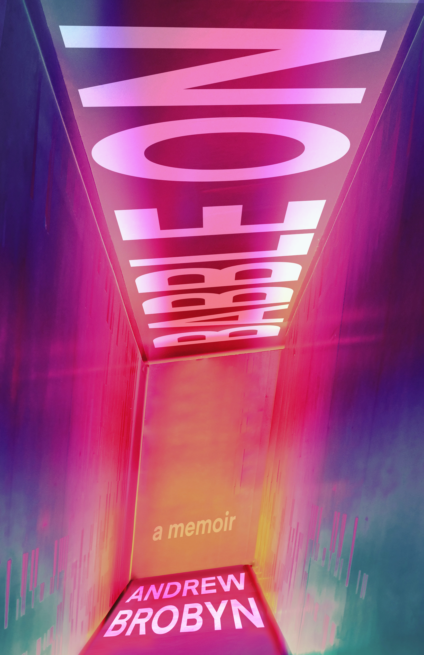
I’ll throw in this other one too because I personally quite like it, though I get why other people on the team didn’t get on board with it. Be careful when you look at it, you will get sucked in.